The scenario
Elevating skincare through thoughtful branding.
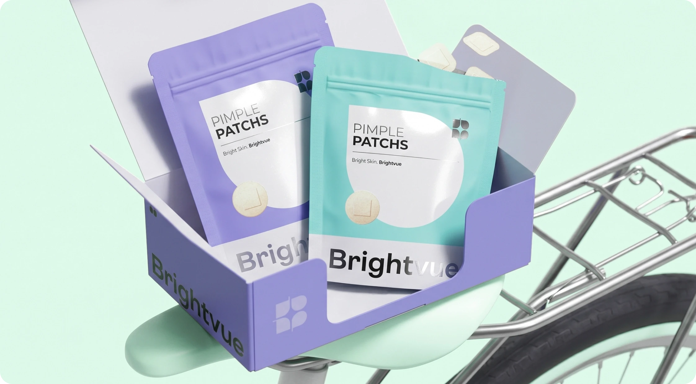
Brightvue was born with a clear purpose: to offer personal and skincare solutions that combine purity, comfort, and targeted rejuvenation. The brand needed a visual identity that would translate its holistic and sophisticated essence, reflecting the safety and effectiveness of its products. The challenge was to create a brand that inspires confidence and encourages intentional self-care.





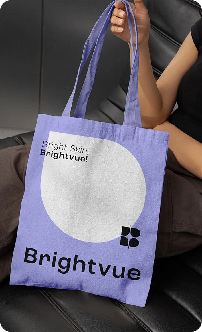
Bright Skin
Brightvue!

The family is complete!
We immersed ourselves in Brightvue’s world to develop a visual identity that communicates its mission with clarity.
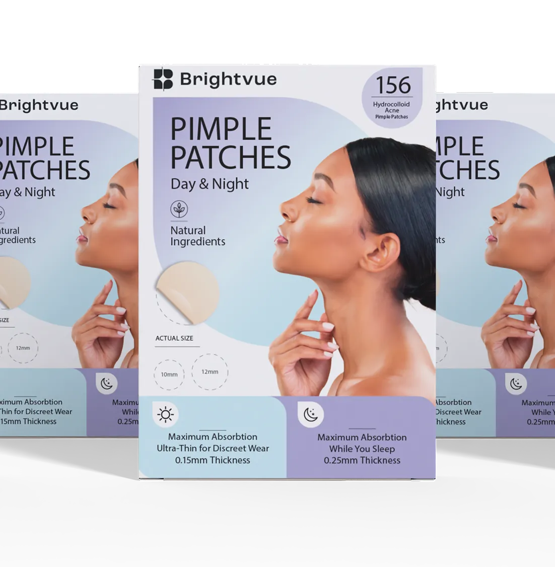
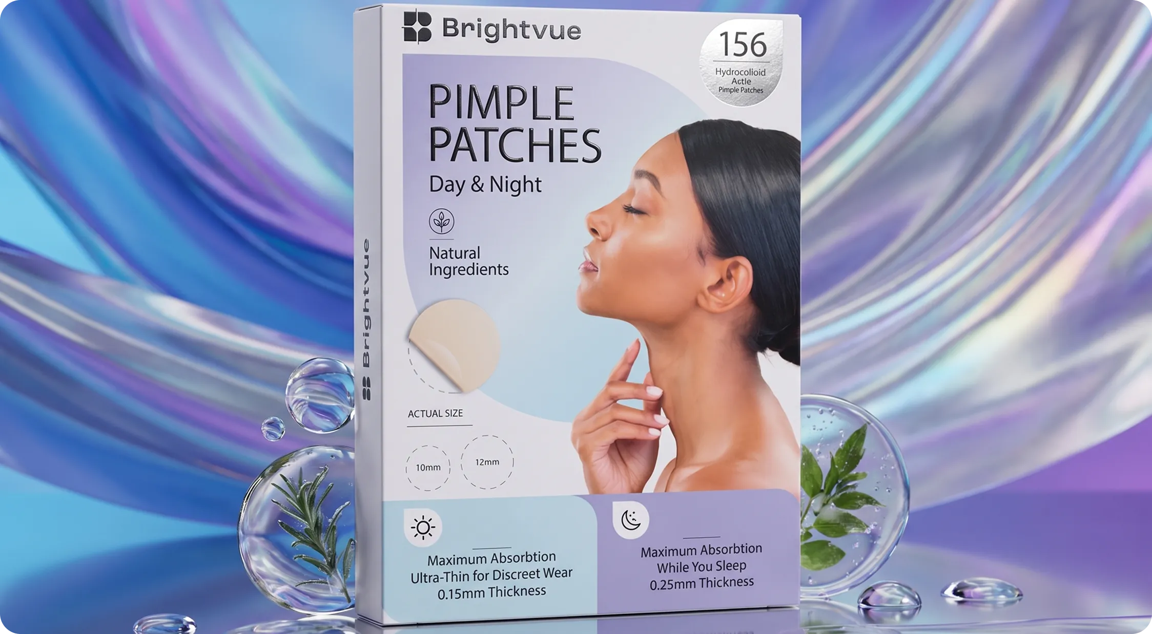
From the color palette to the typography and packaging, every element conveys lightness and sophistication.
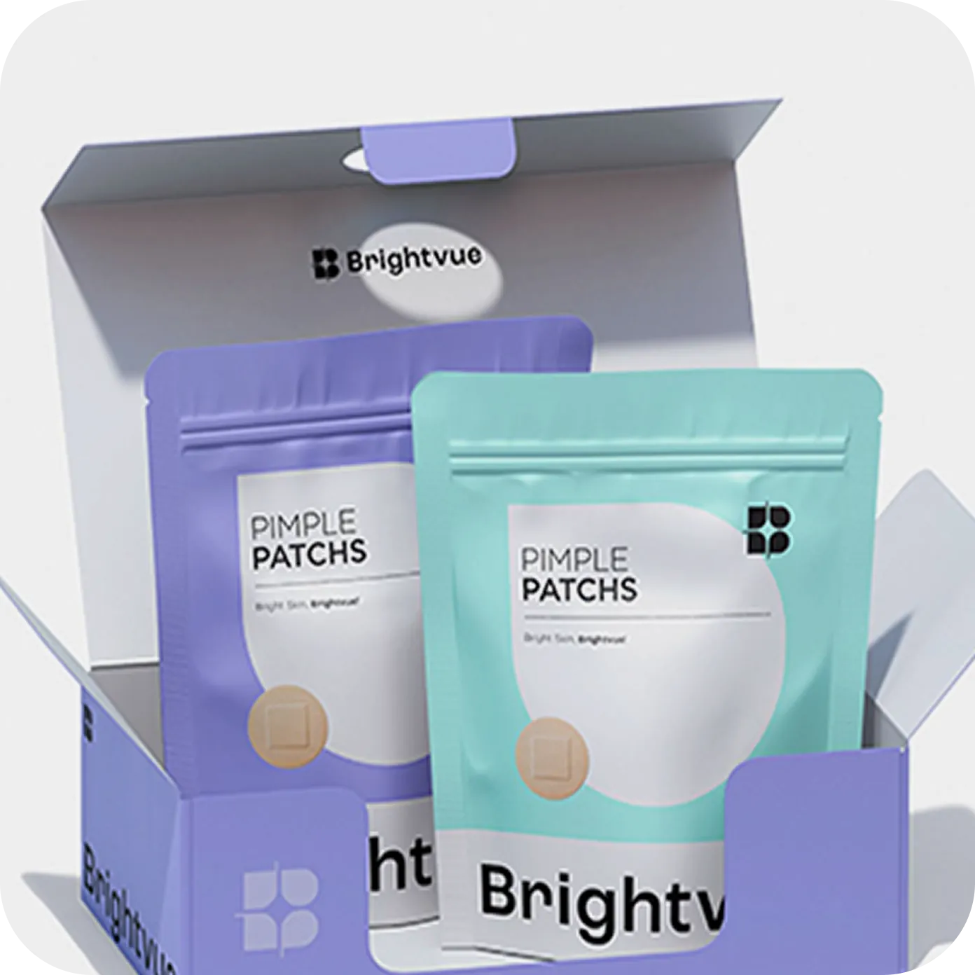
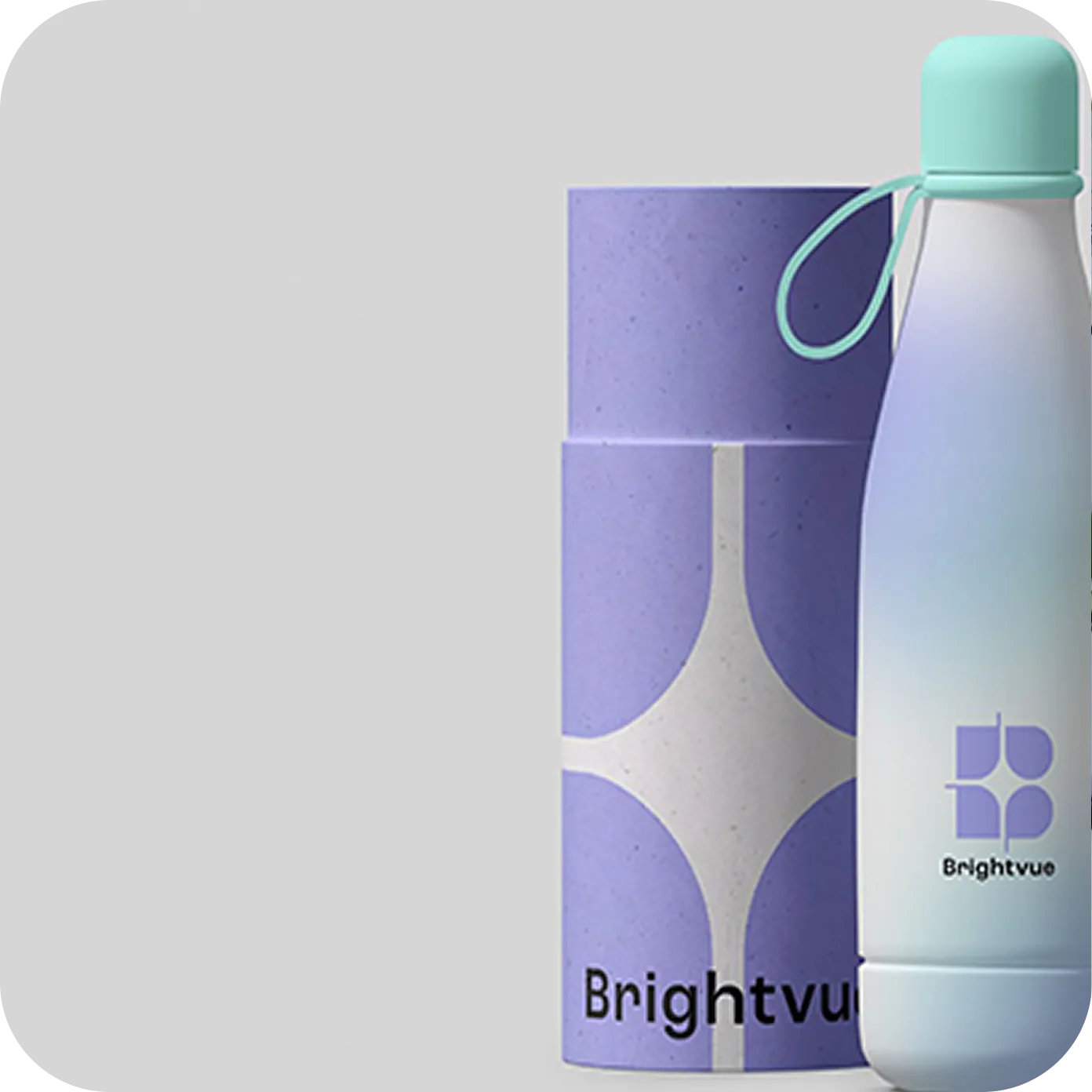
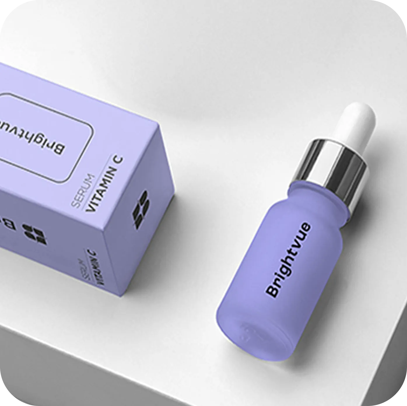

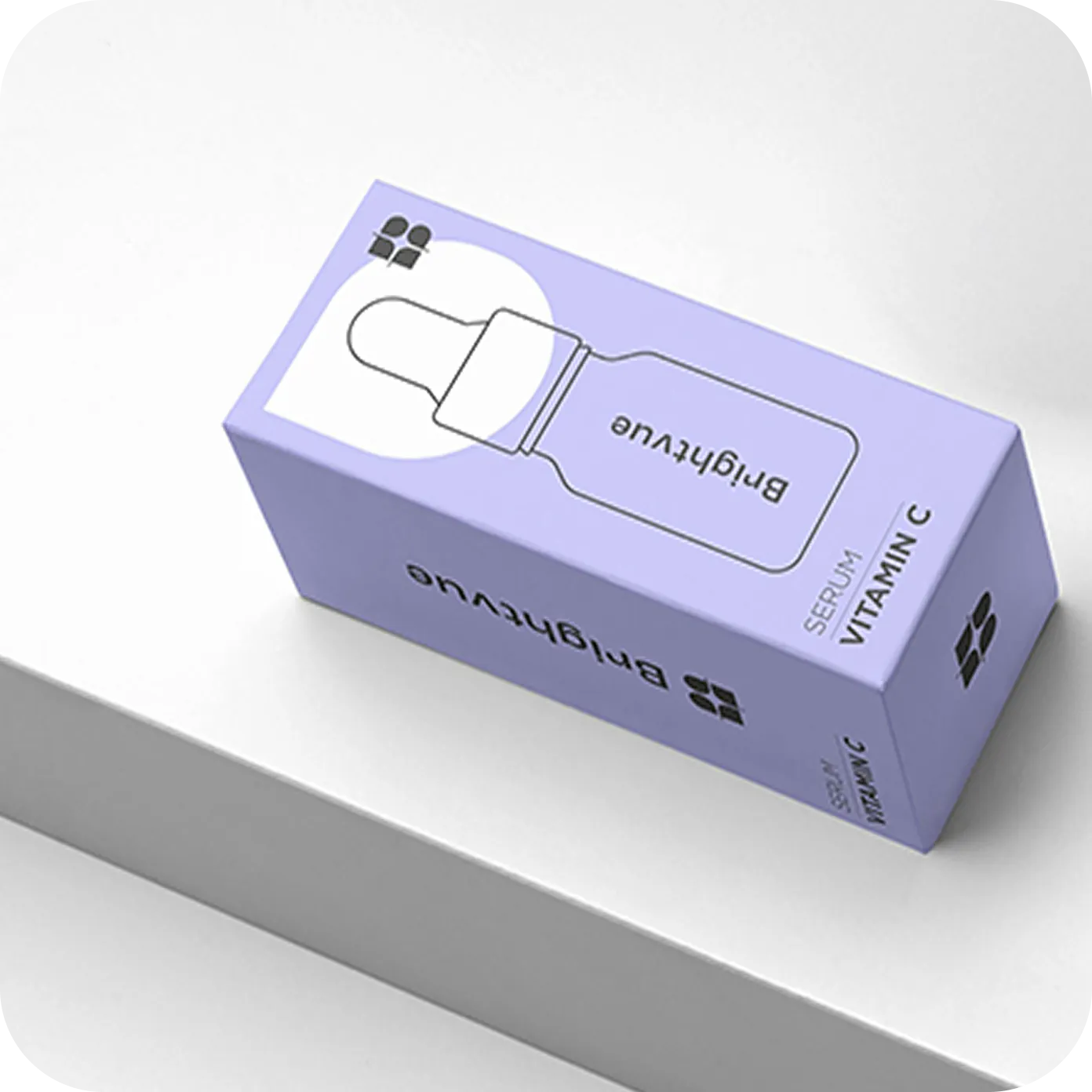
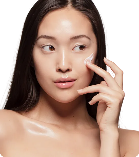
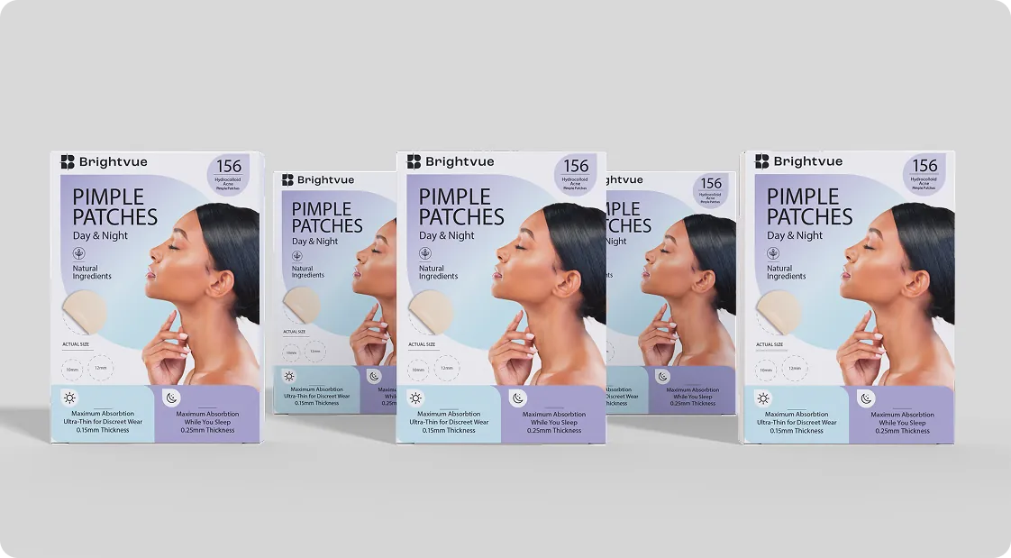
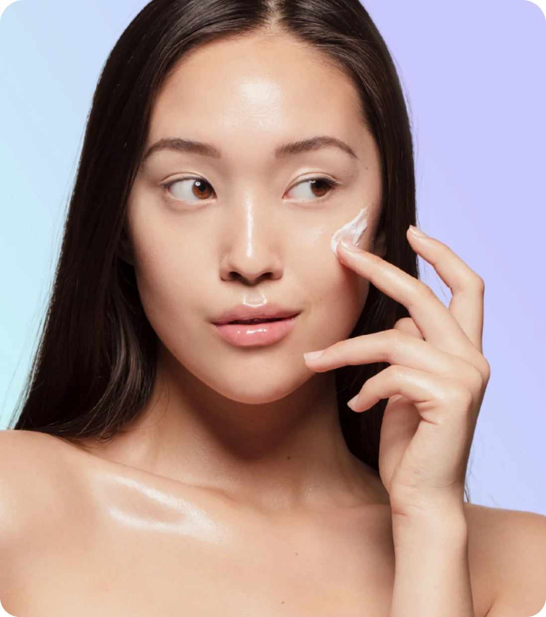
We created a branding approach that balances minimalism and personality, ensuring that Brightvue stands out in the market as a trustworthy and innovative brand.
From the choice of color palette to typography and packaging design, every element was carefully considered to convey lightness, sophistication, and well-being at every touchpoint.
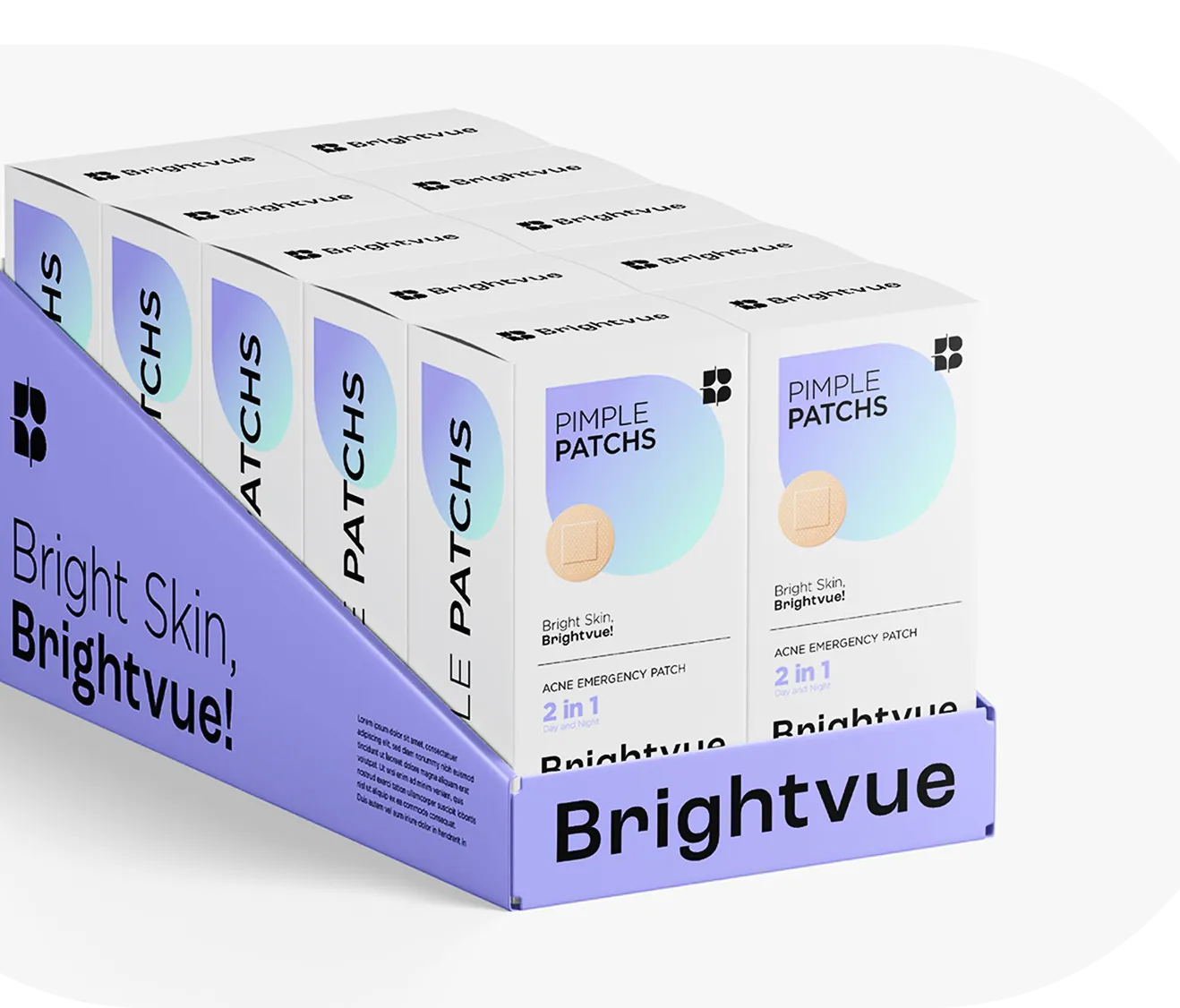
The result is a system that scales: the same rules hold on a single sachet, a retail tray and a full display, so the brand reads the same up close and across the aisle.
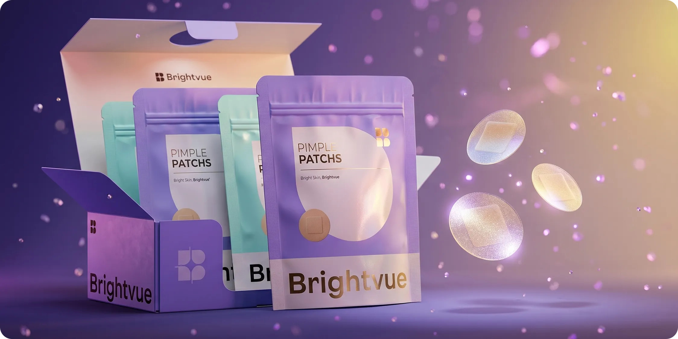
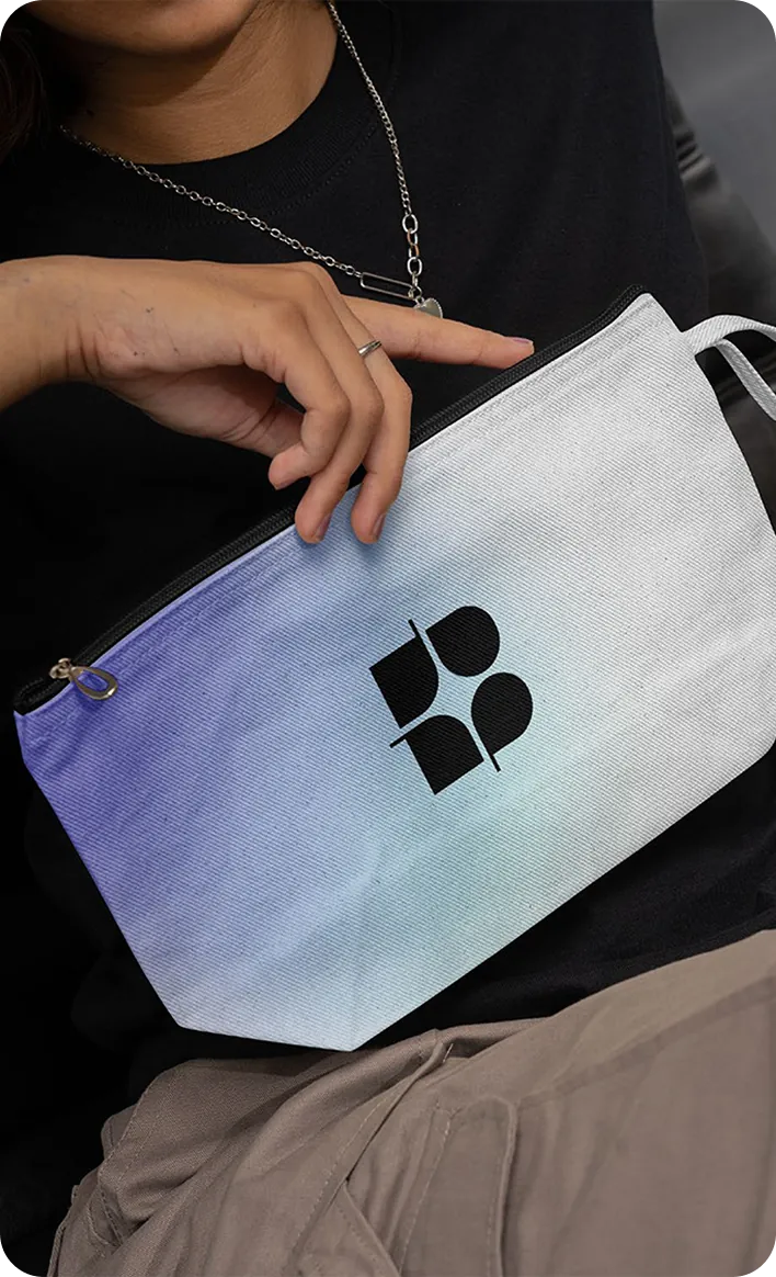
Brightvue arrived on the shelf with a language of its own: one mark, one gradient and one voice, in every format the line ships in.
Shoppers recognize the range before they read a word, and new products join it without a redesign every time the catalog grows.
With our expertise, we helped Brightvue turn its vision into reality, creating a brand that not only cares for the skin but also enhances the confidence and well-being of its consumers.
Bright Skin, Brightvue!