The scenario
Sparking imagination through thoughtful design.
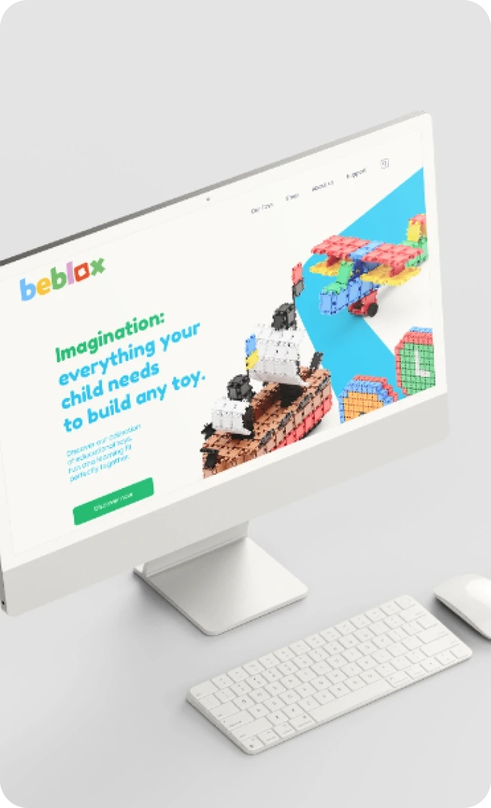
Beblox is a toy brand built to ignite children’s imagination and creativity while keeping play away from a screen. The challenge was a foundation strong enough to carry naming, packaging and a storefront at once, in a category crowded with lookalikes. It had to read as playful to the child holding the box and as trustworthy to the parent who is actually the one paying for it at the till.




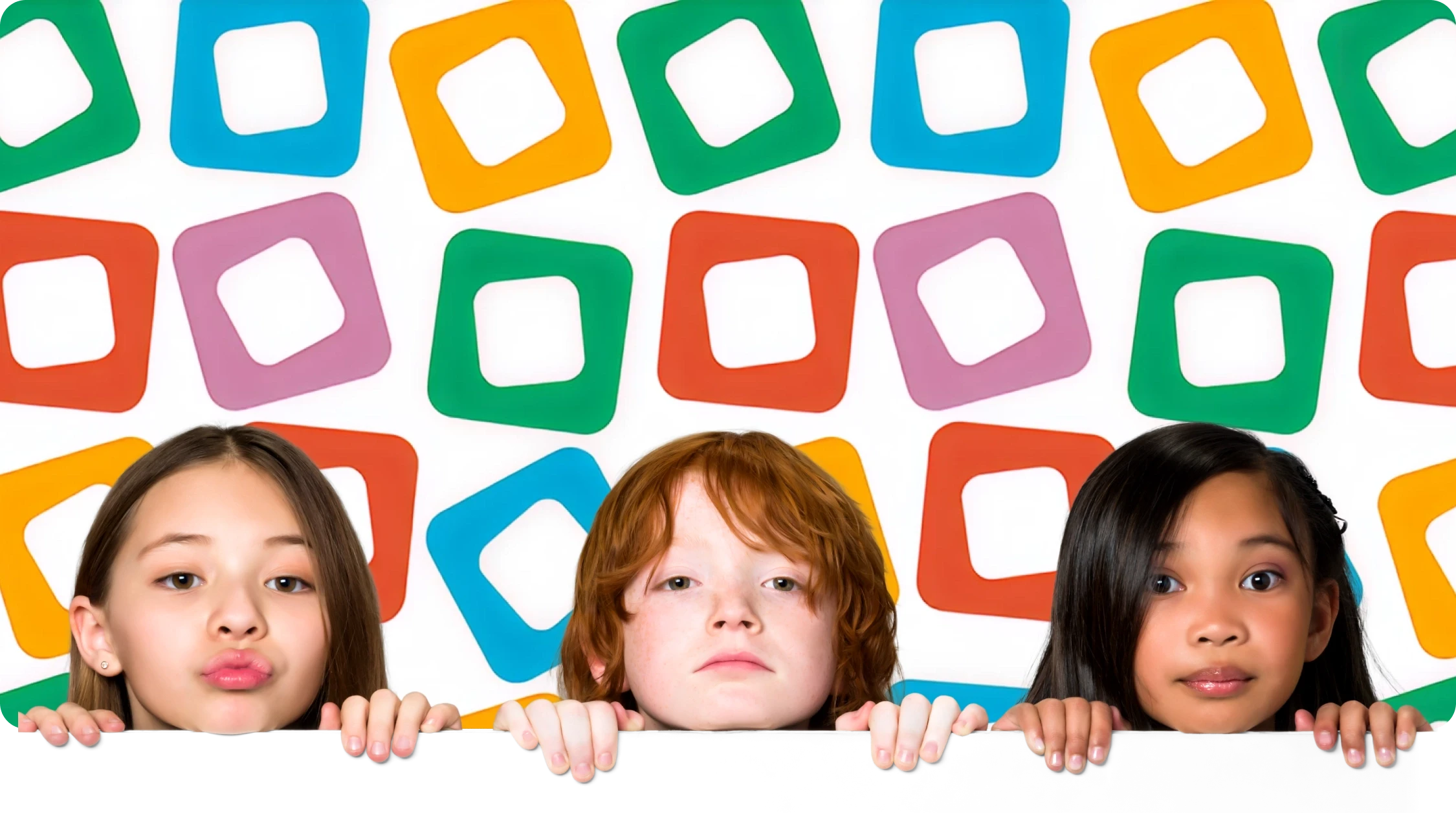
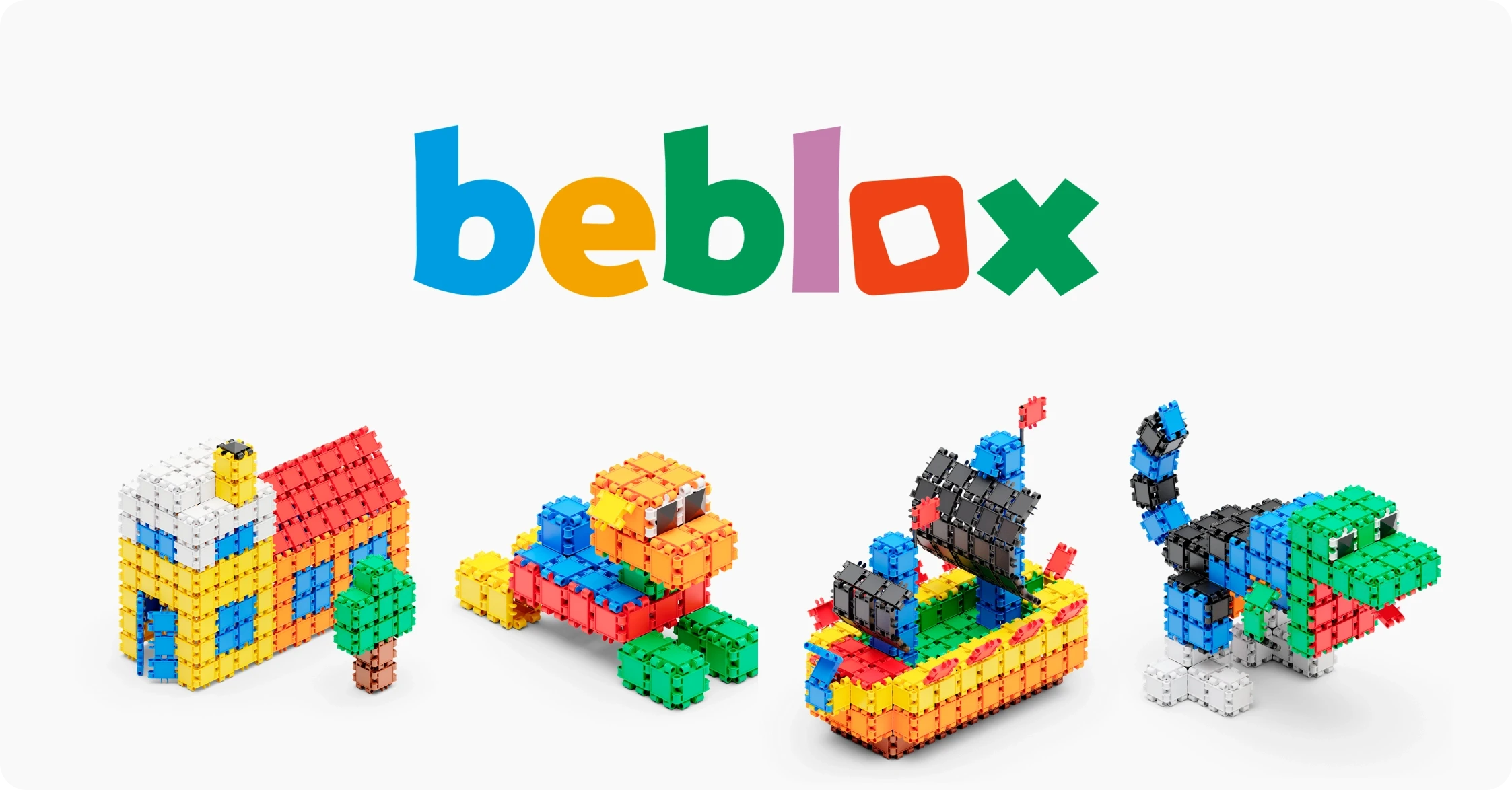
The family is complete!
We immersed ourselves in Beblox’s world to develop a visual identity that communicates its mission with clarity.
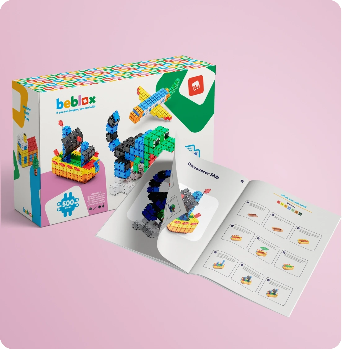
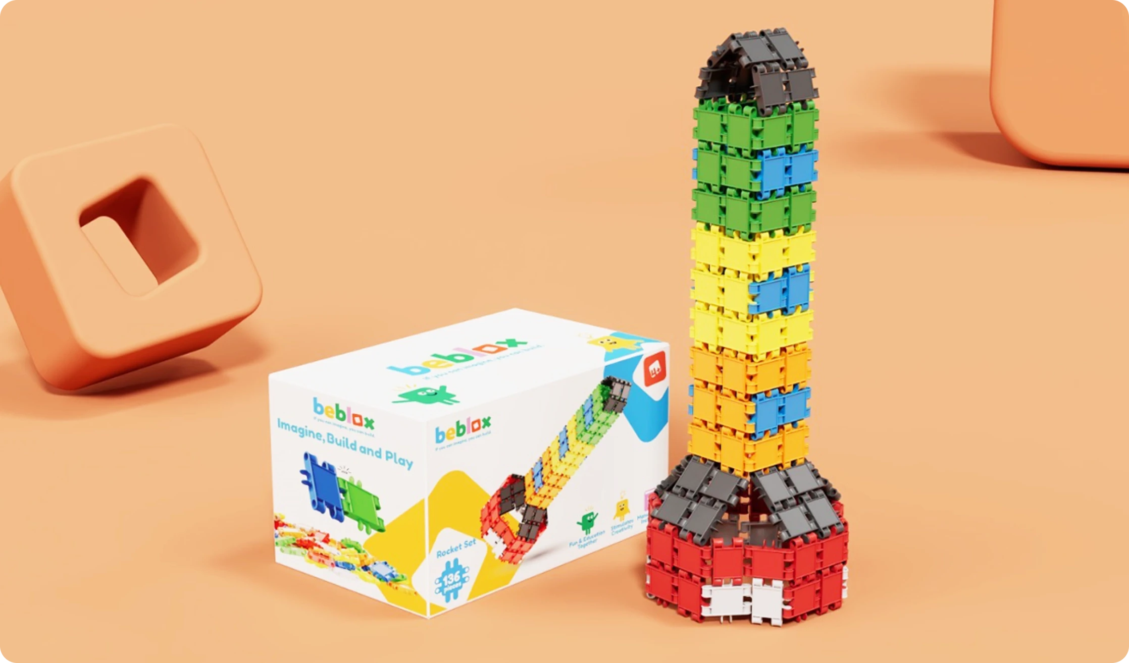
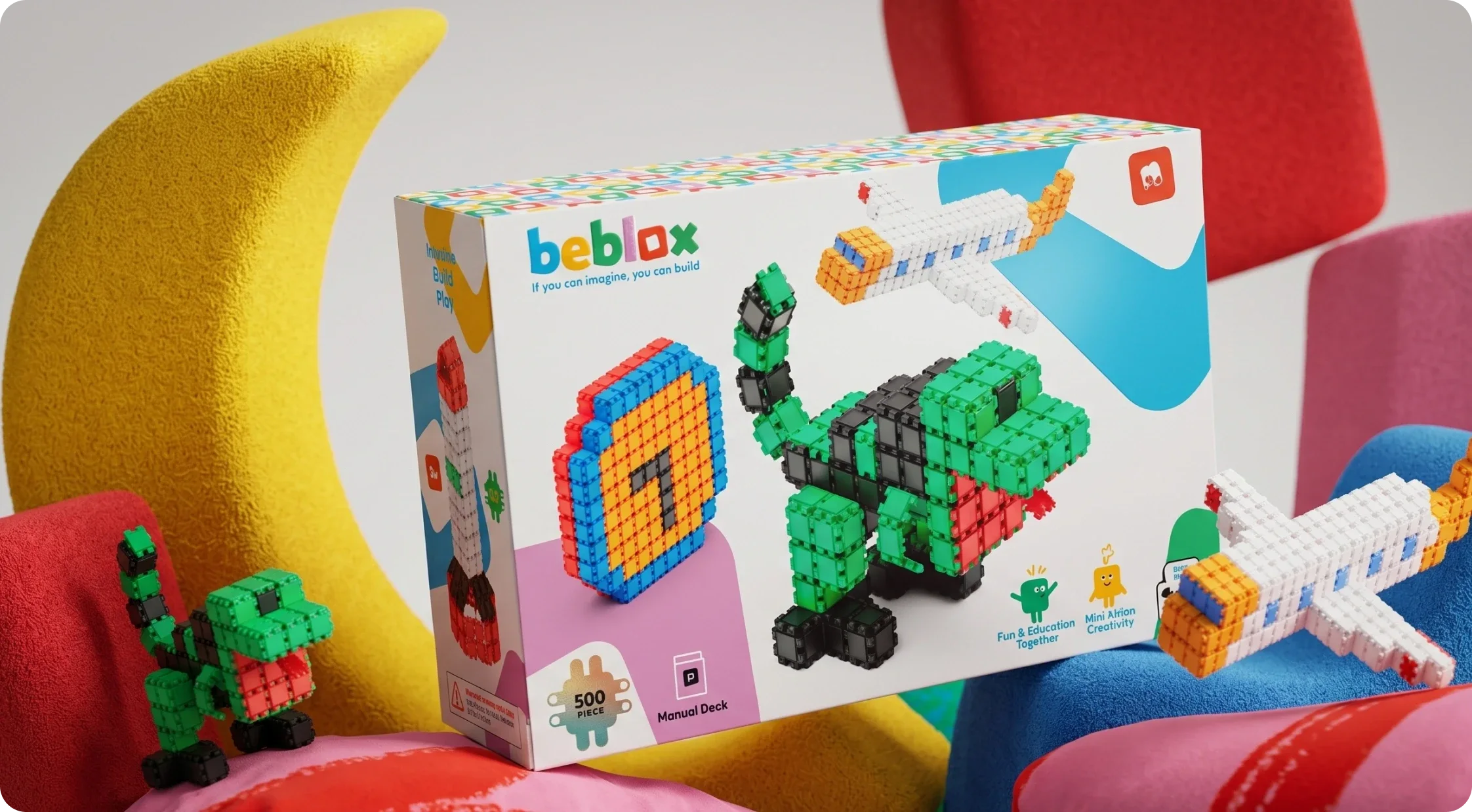
From the color palette to the naming and packaging, every element conveys energy and imagination, up close.
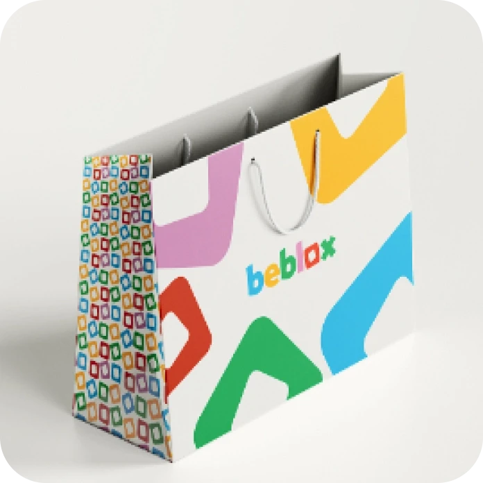
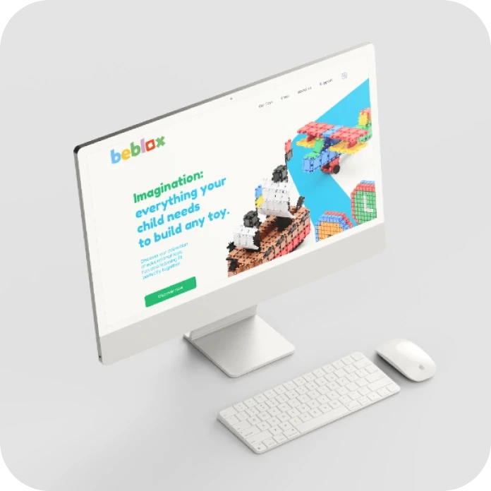
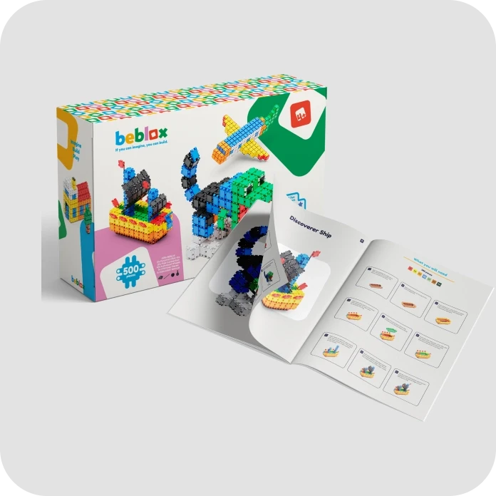
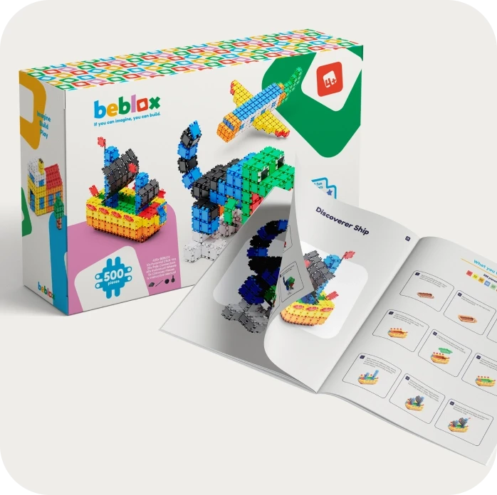
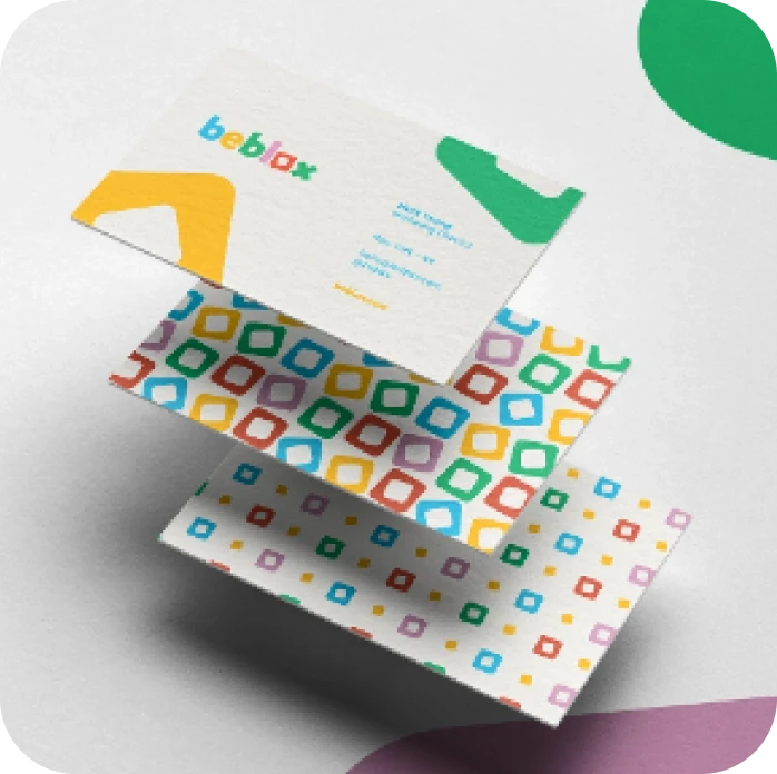
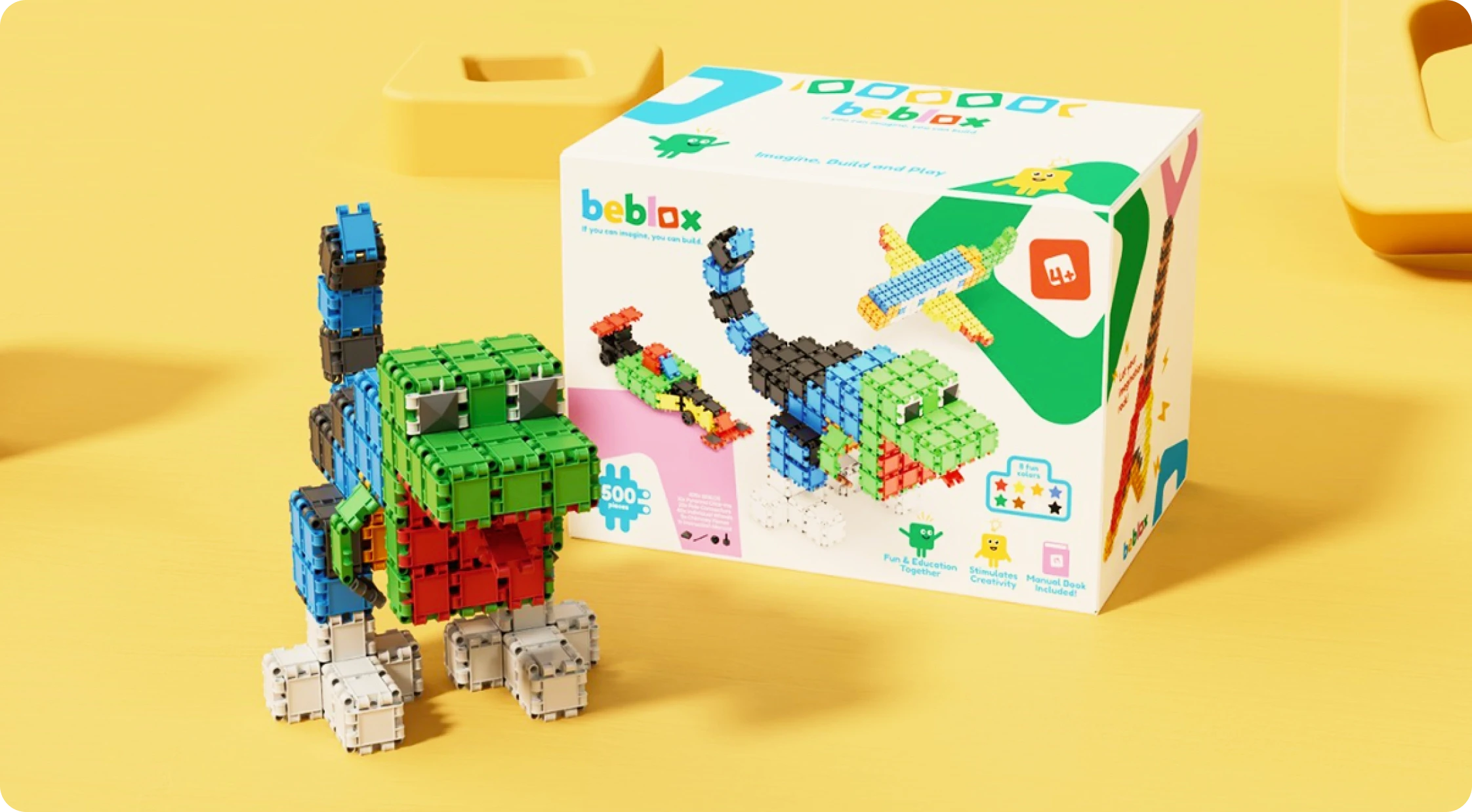
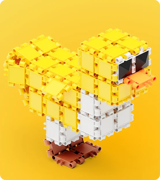
We created a branding approach that balances play and clarity, ensuring that Beblox stands out on a crowded shelf as a brand that children want and parents trust.
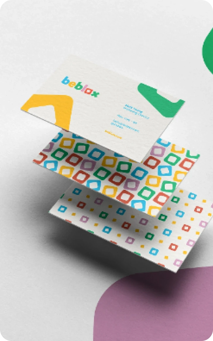
From the choice of color palette to typography and packaging design, every element was carefully considered to convey curiosity, learning, and shared joy at every touchpoint.
The result is a system that scales: the same rules hold on a single pack, a shelf row and a full display, so the brand reads the same up close and across the aisle.
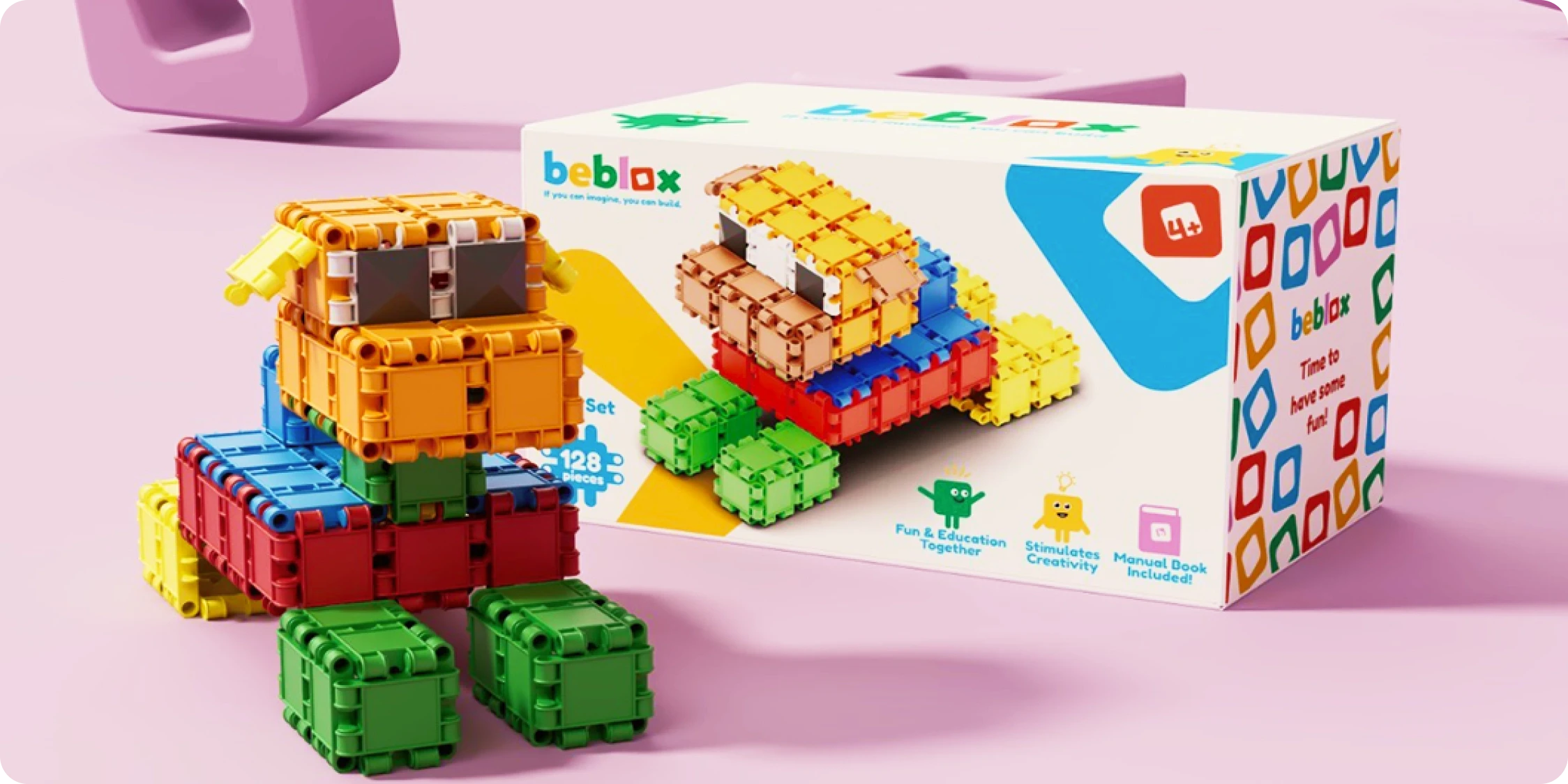
Beblox arrived on the shelf with a language of its own: one mark, one palette and one voice, in every single format the line ships in.
Parents recognize the range before they read a word, and new sets join it without a redesign every single time the catalog grows.
With our expertise, we helped Beblox turn its vision into reality, creating a brand that not only entertains the children who play with it but also earns the confidence of the parents who buy it.
If you can imagine it!!