The scenario
Everyday care through a cleaner smarter standard.
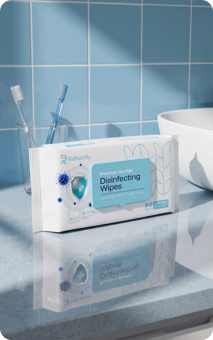
Refreshify was created to lift daily personal care with premium materials, gentle performance and responsible production. The challenge was an identity that could read as premium without pricing itself out of a daily routine, in a market where shoppers expect products to be effective, elegant and easy to use. It had to feel refined and still disappear into the everyday routine at home.



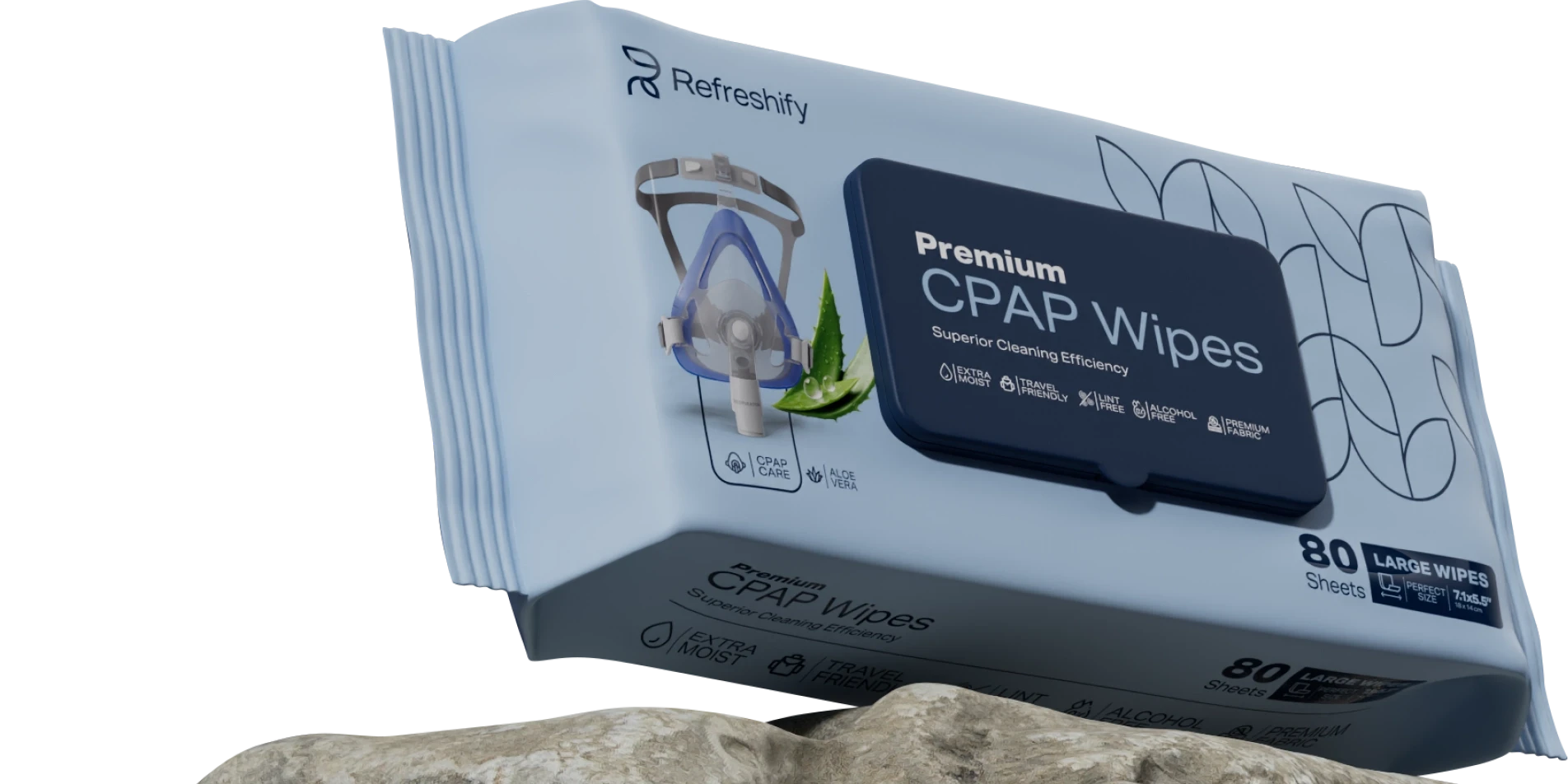

Soft touch, deep clean, maximum protection.
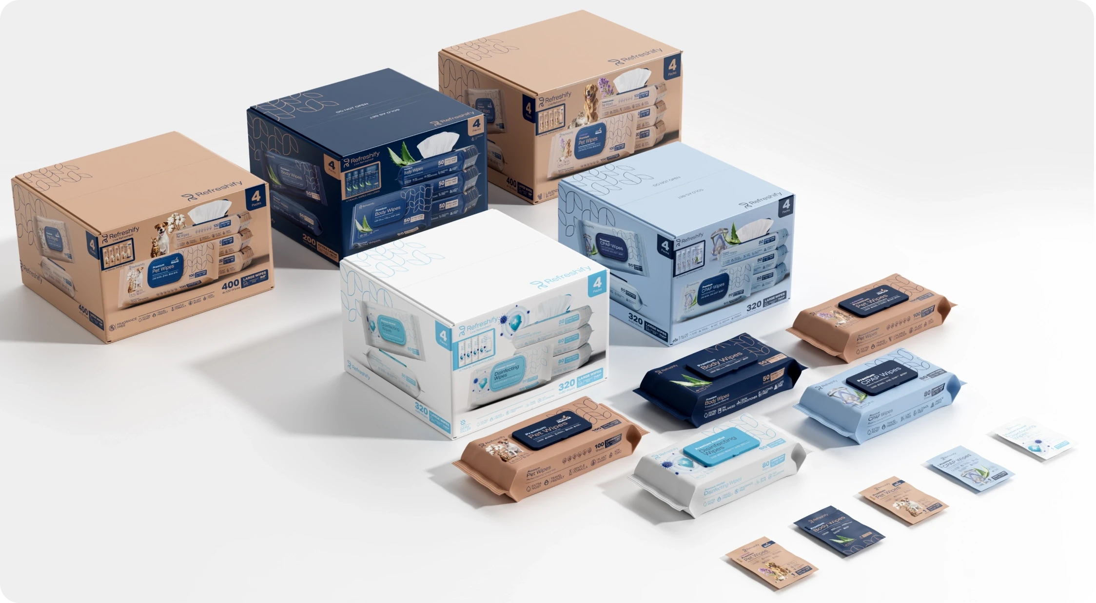
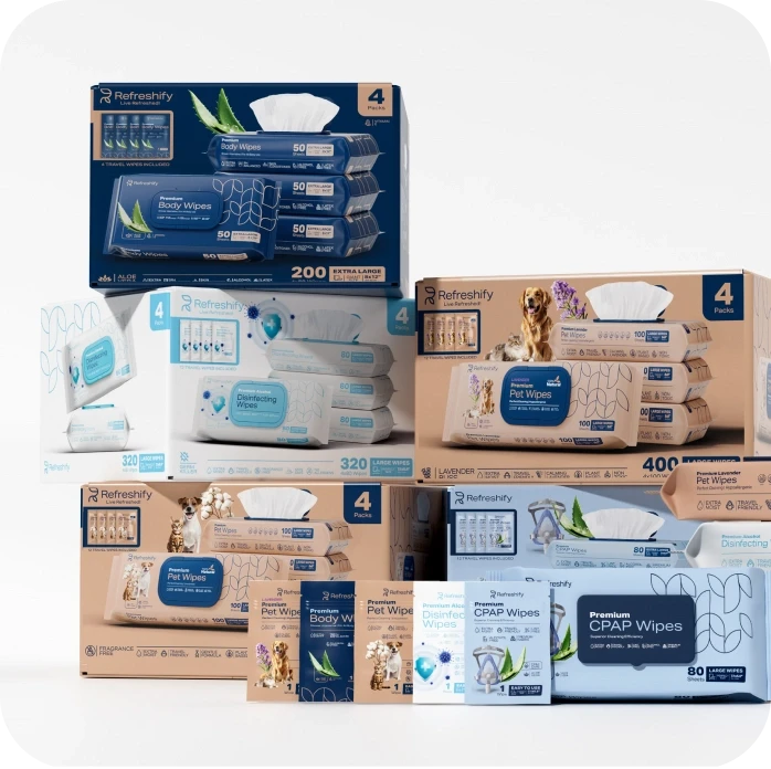
The family is complete!
We immersed ourselves in Refreshify’s world to develop a visual identity that communicates its mission with clarity.
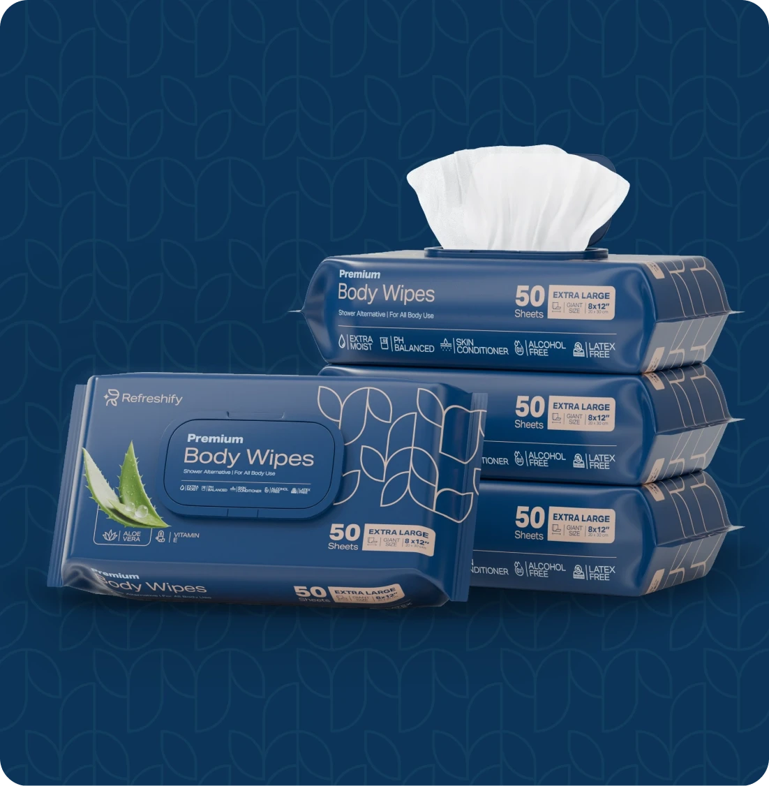
From the color palette to the typography and packaging, every element conveys calm and precision.
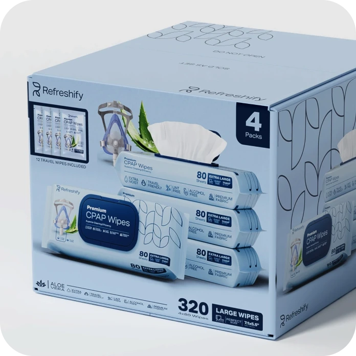
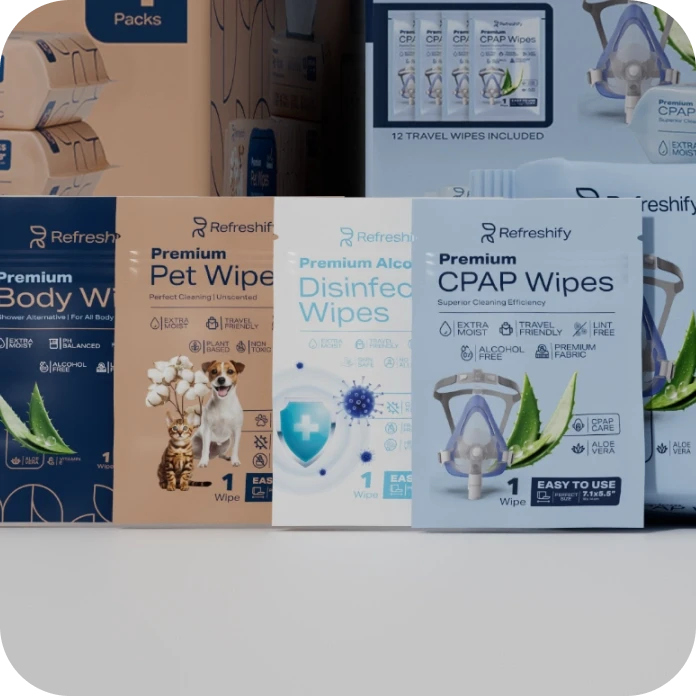
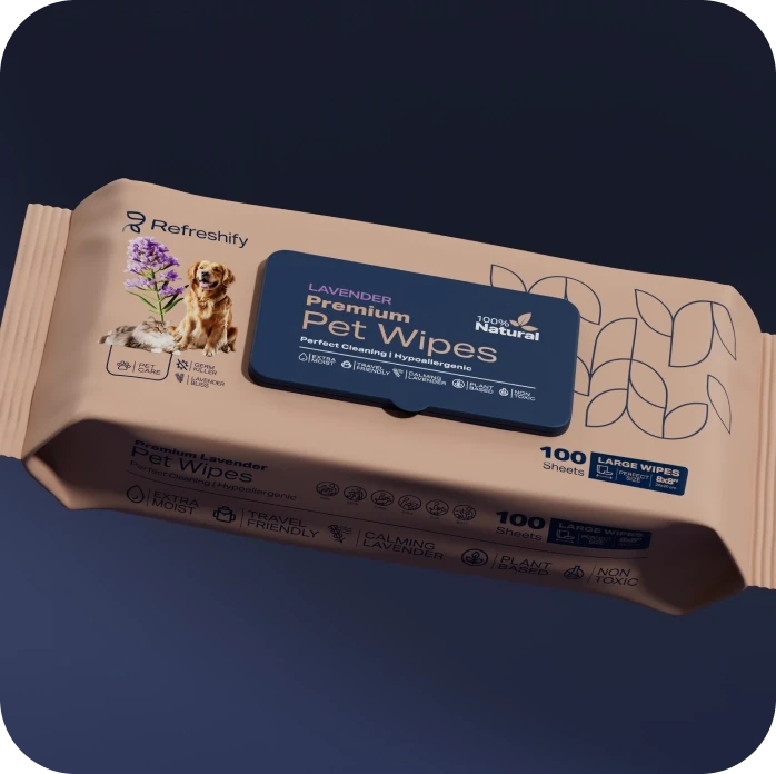
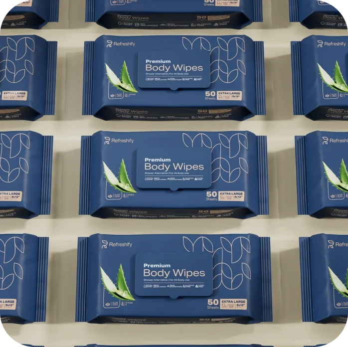
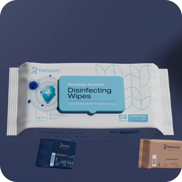
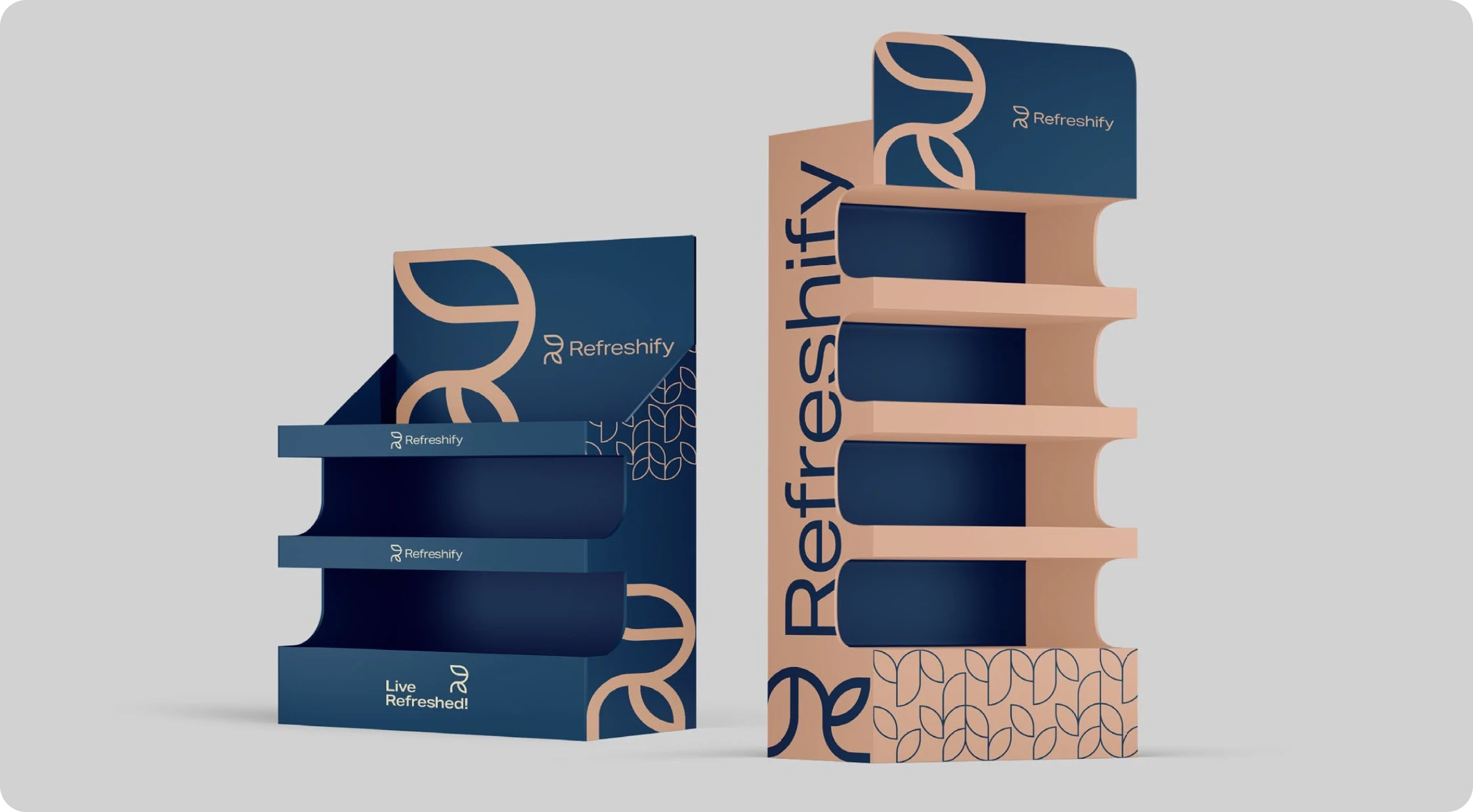
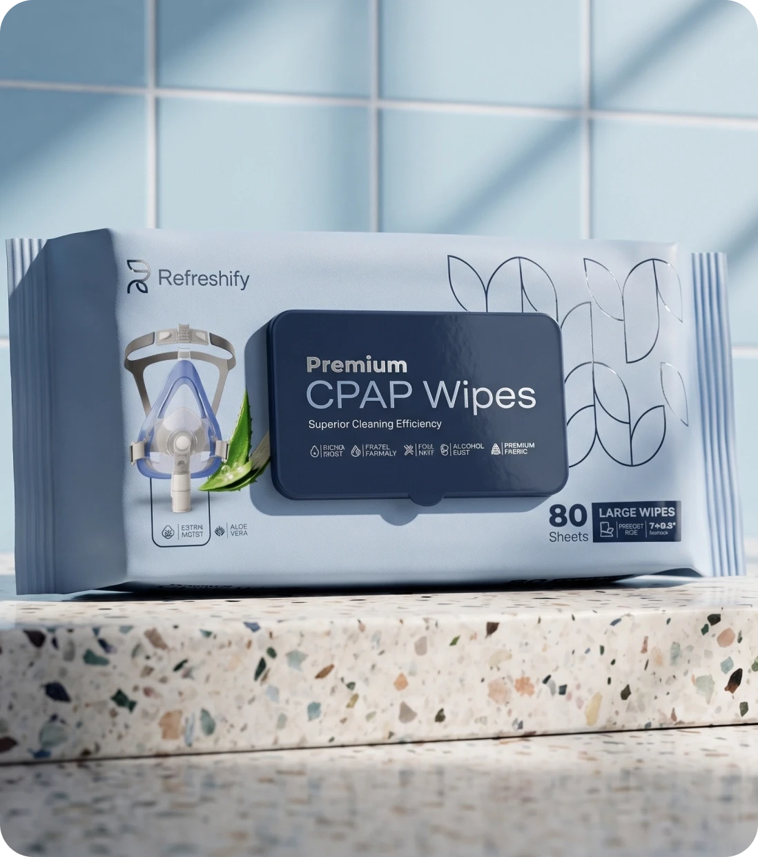
We created a branding approach that balances restraint and warmth, ensuring that Refreshify stands out in a crowded market as a careful and genuinely modern brand.
From the choice of color palette to typography and packaging design, every element was carefully considered to convey comfort, cleanliness, and ease at every touchpoint.
The result is a system that scales: the same rules hold on a single pack, a shelf row and a full display, so the brand reads the same up close and across the aisle.
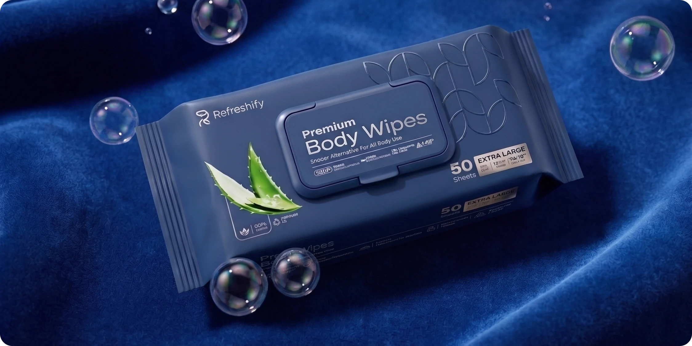
Refreshify arrived on the shelf with a language of its own: one mark, one palette and one voice, in every format the line ships in.
Shoppers recognize the range before they read a word, and new products join it without a redesign every time the catalog grows.
With our expertise, we helped Refreshify turn its vision into reality, creating a brand that not only cleans and cares but also makes an ordinary daily routine feel a little better.
Refreshingly simple!!