Elevating skincare through thoughtful branding & packaging!
Brightvue was born with a clear purpose: to offer personal and skincare solutions that combine purity, comfort, and targeted rejuvenation.
The brand needed a visual identity that would translate its holistic and sophisticated essence, reflecting the safety and effectiveness of its products. The challenge was to create a brand that inspires confidence and encourages a lifestyle based on intentional self-care.
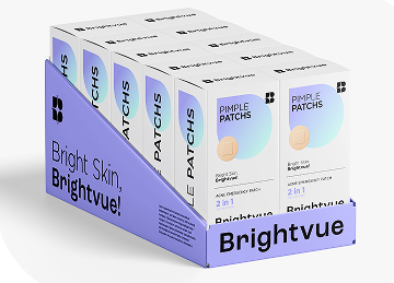
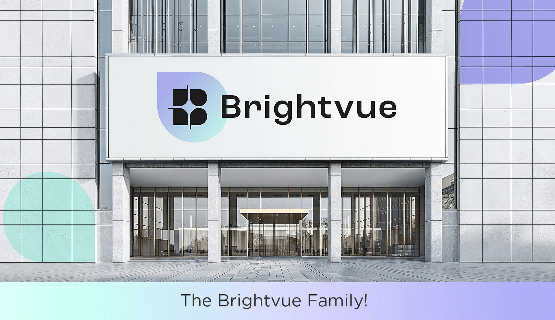
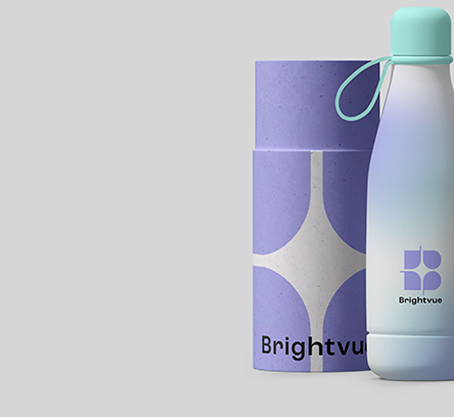
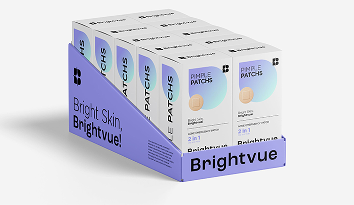
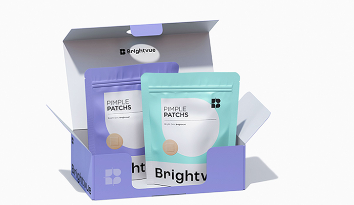
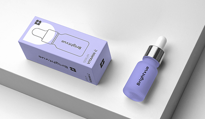
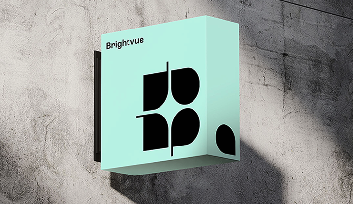
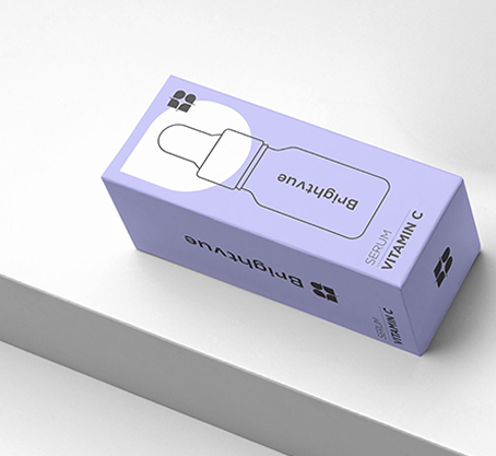
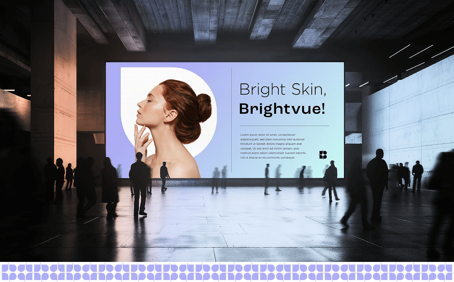
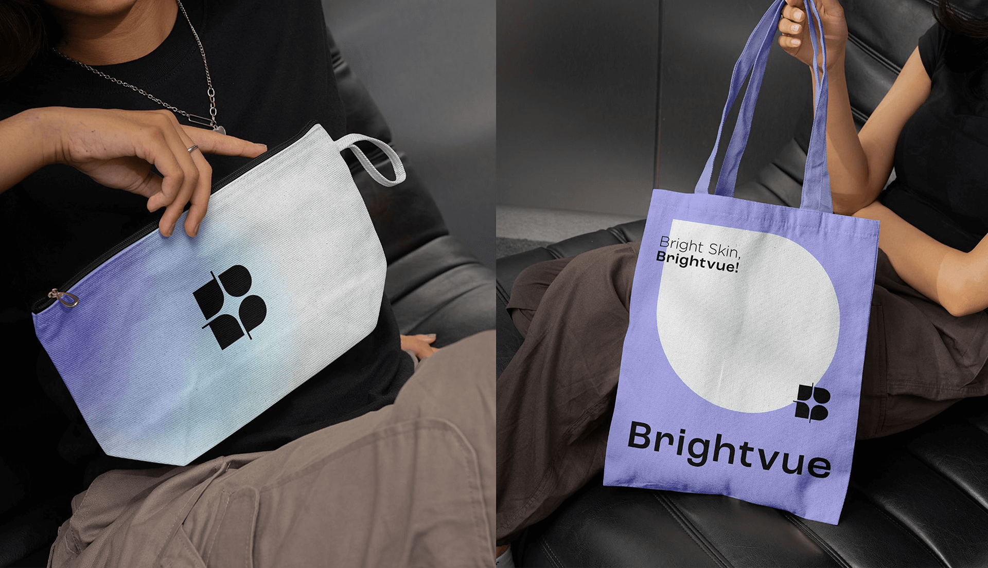
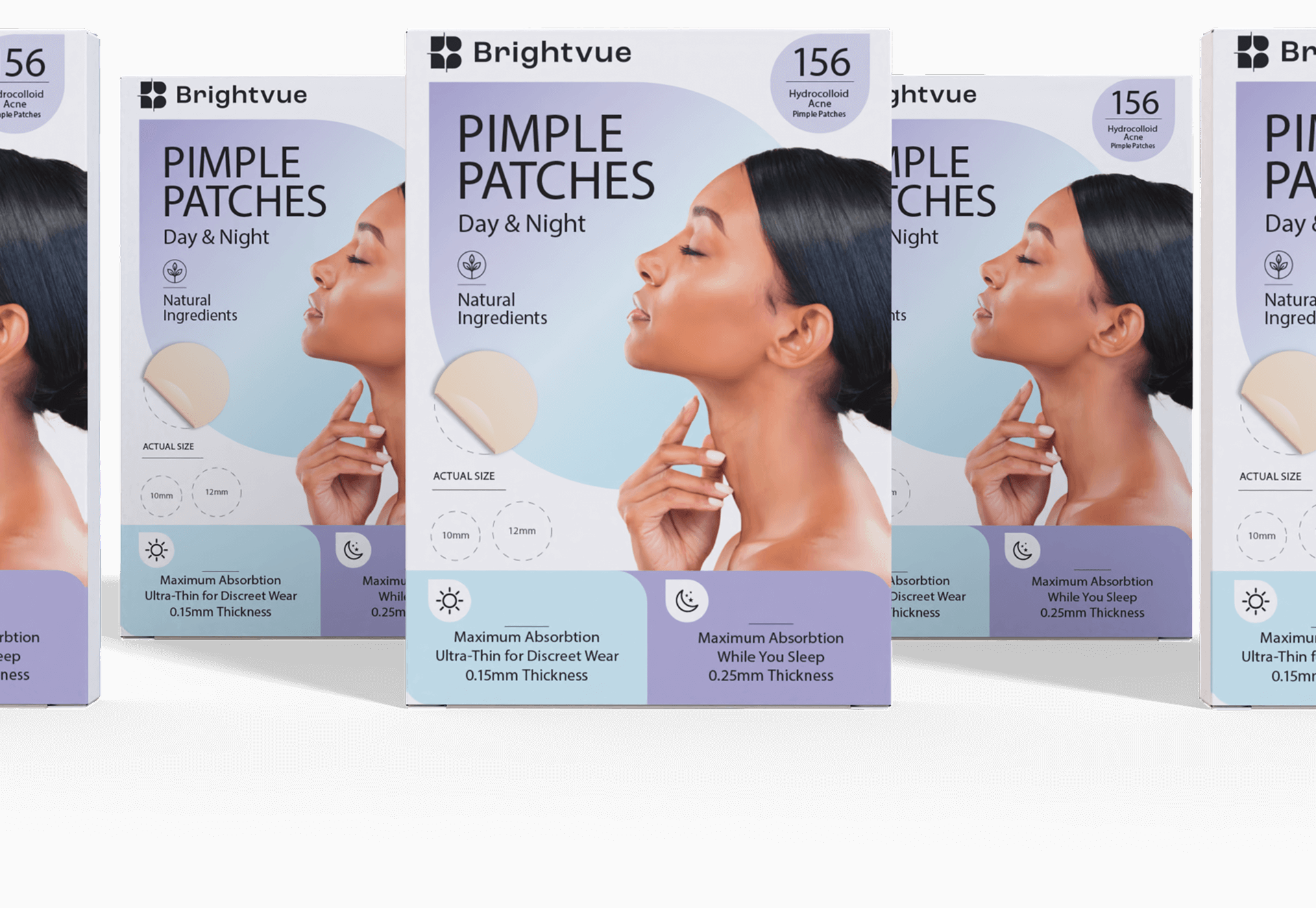
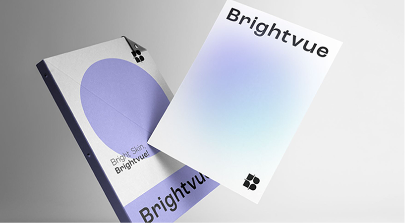
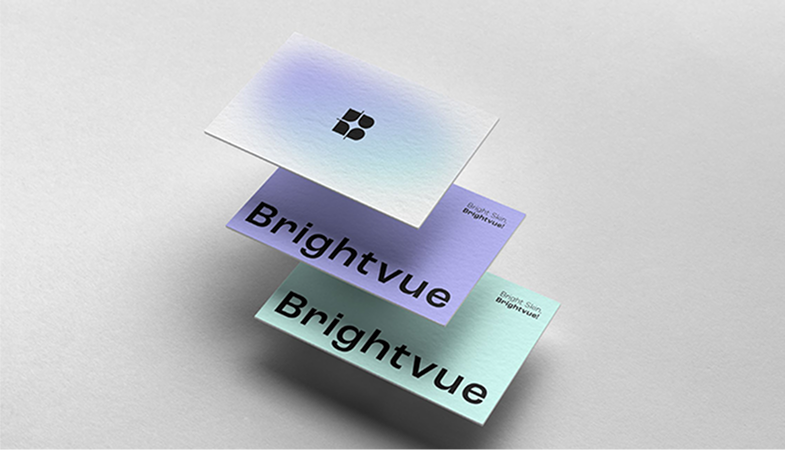
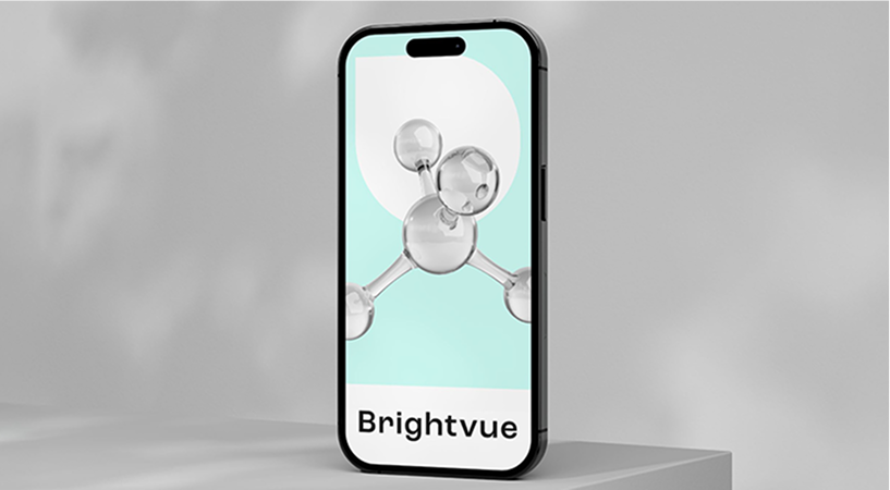
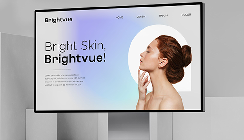
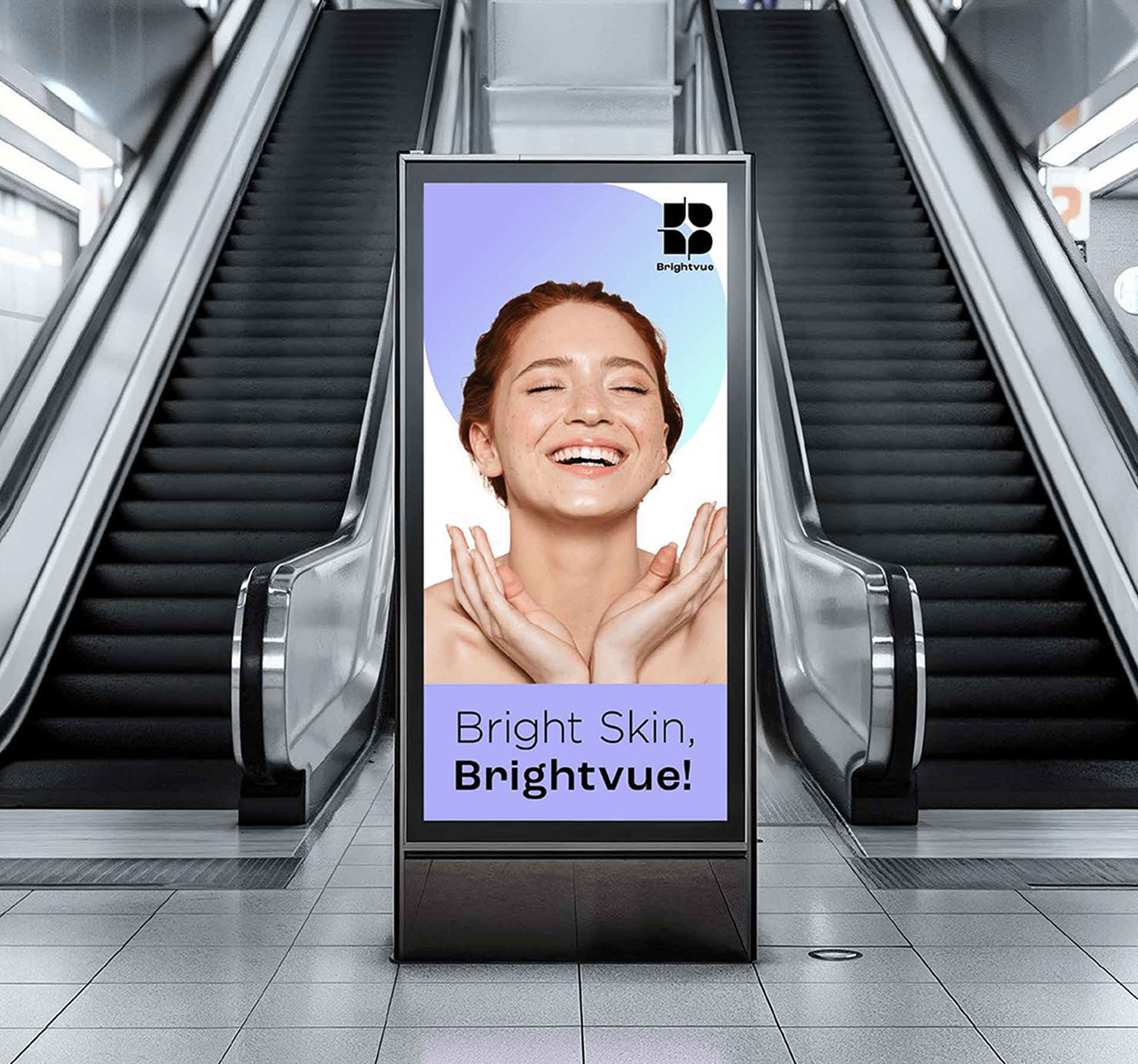
We immersed ourselves in Brightvue’s world to develop a visual identity that communicated its mission with clarity and impact. From the choice of color palette to typography and packaging design, every element was carefully considered to convey lightness, sophistication, and well-being. We created a branding approach that balances minimalism and personality, ensuring that Brightvue stands out in the market as a trustworthy and innovative brand.
We immersed ourselves in Brightvue’s world to develop a visual identity that communicated its mission with clarity and impact. From the choice of color palette to typography and packaging design, every element was carefully considered to convey lightness, sophistication, and well-being.
We created a branding approach that balances minimalism and personality, ensuring that Brightvue stands out in the market as a trustworthy and innovative brand.
With our expertise, we helped Brightvue turn its vision into reality, creating a brand that not only cares for the skin but also enhances the confidence and well-being of its consumers.
With our expertise, we helped Brightvue turn its vision into reality, creating a brand that not only cares for the skin but also enhances the confidence and well-being of its consumers.